Going through a website revamp and redesign is A LOT of work. My previous website launched almost 7 years ago but internet years are like dog years and I was long overdue for a change.
I had no idea what to expect when I finally decided to undertake this rebrand project that included everything. And when I say everything, I mean everything - new logo, website, blog, e-commerce, fonts, business cards, identity, colors, everything. Luckily for me I enlisted the incredibly talented Erika Brechtel to work with me and I’m sharing the four biggest lessons I learned.
1. Take Your Time
I started to think very seriously about a redesign over two years ago. I wanted to have everything in one place--paintings, fine art photos, and portrait sessions--but it needed to be user-friendly and not so busy that it would be overwhelming and crowded. I didn’t know where to begin to envision a site that had all the stuff I needed/wanted mine to have. It became very clear to me that I couldn’t do it myself and I needed to scout and hire a designer. I did all the research and found the perfect fit for me and my style. It took me an entire year just to figure out how I wanted to do this and another year to conceptualize it with Erika and build it with Peter Lisanti, my developer. There is so much power in asking questions and in listening. In the end, I’m grateful I took my time, asked all the questions, didn’t rush and, very importantly, that I worked with some very smart, patient and talented people.
2. Have a clear vision
I had so many ideas of what I wanted this site to be but I found that narrowing the scope and having a clear vision to communicate to my designer were paramount to doing it successfully. I spent a lot of time researching and visiting sites that I liked and those that I didn’t in order to determine what would work best for what I wanted to accomplish. Erika was amazing at helping me hone my vision and ideas starting with a branding questionnaire. I also created a Pinterest board to gather my thoughts where I pinned everything that I loved in order to help with the design direction.
I tend to overthink things and get bogged down by details but Erika helped me determine my WHY, worked with me to develop a cohesive plan, got me to focus on my ideal client and customer, and then my vision grew from there until she created an overall design that was basically perfect for me and aligned with my goals. I learned that once you do the research, determine your point of view and hone your identity, the design will flow from there.
3. Be Directional
Having a clear direction for your site is key. My previous websites had very little focus and I was determined to make my new site efficient, directional and clear so users and potential clients could know exactly where I wanted them to go and why. It’s important to make your goal known and for every page to have a purpose. There’s way too much to look at online and if you don’t capture someone’s attention in less than 30 seconds and make the goal of your site apparent from the get-go, they won’t hang around to see all that you have to offer.
4. Stay Authentic and True to Yourself
As much research and clicking that I did, I knew that I wanted and needed the site to be all me. Erika constantly reminded me about my value and when I look back at my notes I see that word everywhere. Your site should reflect your voice and celebrate the value you add to your industry and your pocket of the internet. For me it was all about showing the work whether it was my paintings, my fine art photos or my portrait work. Your site should be all yours and unlike anyone else’s because your work is all yours and unlike anyone else’s. Embrace that fact. Own it. All design and style is derivative in some way but if you focus, make sure your site has direction and honors who you are, the work will truly stand out and speak to the right clients and isn’t that what counts?
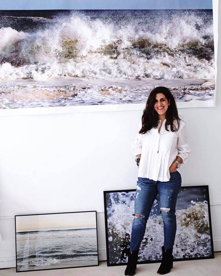
Portrait by Doug Schneider Photography


